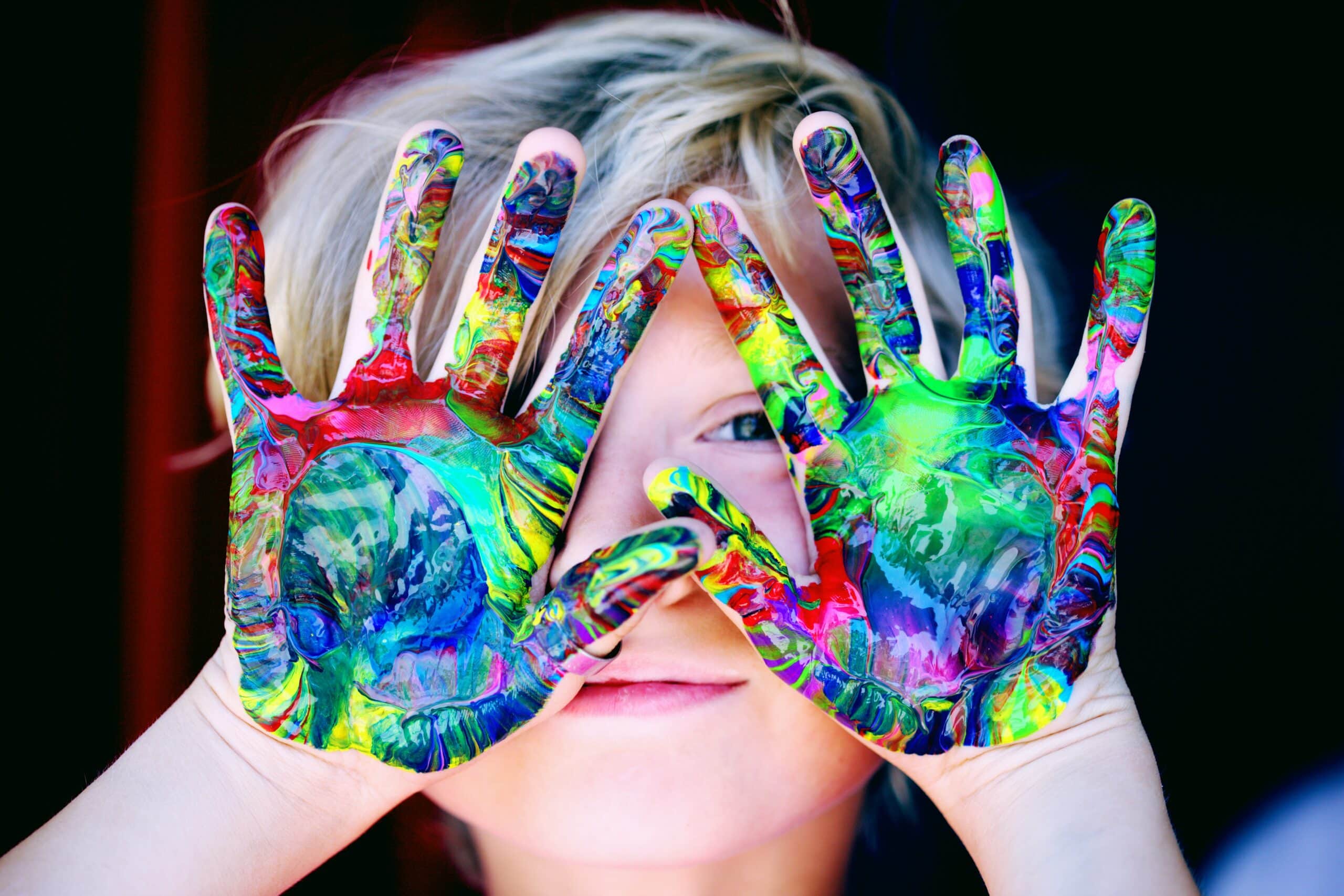
Using Color Psychology on Websites to Create Impactful Design
 Color psychology on websites involves finding the right colors to use on your website and having them work systematically. It can be a tricky business.
But, color selection and use is an art of and in itself.
All colors have a specific personality and impart an emotional involvement in every aspect of website design.
They make up an important part of your marketing toolkit, albeit on a subconscious level.
Color Psychology: A Quick Intro
Website colors visually impact your visitors. Not only do these aesthetically beautify your website, but they also influence how your visitors feel and act. Thus, color psychology relates to the science of how different colors drive human emotions and behaviors.
The colors you choose for your site set its mood and help your brand stand for its true meaning. Different colors are tied to distinct experiences and memories.
Thus, using appropriate colors strengthens your brand’s voice, communicates value, creates careful first impressions, and boosts customer retention.
However, color preferences aren’t easy to establish for a given application. So, it’s best to explore, test, and accordingly update your website.
Avoid overloading, blend in with the current choices, and enhance the site’s user interface.
Practical Uses of Color Psychology on Websites
Do you want to know which colors evoke what kind of responses amongst your website visitors? Let’s take you through the values, emotions, and attitudes attached to a few commonly used colors:
Black
~ Classy, Corporate, and Authoritative ~
Black can be sophisticated and sleek but may also be bold and intimidating. Black suggests professionalism, excellence, and substance. The combination you apply on the site makes or breaks the overall user experience.
Blue
~ Cold, Tranquil, and Stabilizing ~
Blue is a universally adored color. It suggests serenity and a sense of assurance. For this reason, larger corporates favor blues more.
However, it isn’t ideal for food websites, as it is an appetite-suppressing color. Besides, darker hues do well for electronic websites, and lighter shades are best for introducing refreshing ideas.
Brown
~ Natural, Earthy, and Dependable ~
Brown is a supportive color that helps establish a soft yet authentic feel to your website. Although less utilized, different shades of browns do well for various industries. Browns are your best friend if yours is a construction, legal, or food website.
Green
~ Relaxing, Refreshing, and Progressive ~
Green is the color of vitality, innovation, being content, and healthy. It’s a great color to help put your website visitors at ease.
The shade is ideal for healthcare and financial sites and works for those advocating environmental causes and outdoor products or services.
Orange
~ Warmth, Buoyant, and Playful ~
It won’t be incorrect to say that orange is the new red. But it is more lively and less provoking. It’s a color of encouragement, happiness, and emotional stimulation. Orange-themed websites are ideal for sports, energy drinks, kids, or fitness-related product categories.
Red
~ Intense, Aggressive, and Powerful ~
Red symbolizes deep emotions and helps create a modern, loud, youthful design. It’s a Call-To-Action color ideal for dating sites, food brands, news portals, or makeup websites. However, the color can also incite aggression, so use it sensibly.
Yellow
~ Livid, Bright, and Thought-Provoking ~
The classic smile emoji is yellow, and so are caution signs. Thus, yellow is known to indicate power and passion. It’s the attention grabber, i.e., a color that screams for attention.
But since yellow is amongst the harshest colors, use the right shades to uplift and enhance the user experience.
White
~ Fairness, Purity, and Excellence ~
Plenty of white gives a cleaner look to every site. Used with a splash of colors, it can help your design pop. If pure white isn’t your style, try using ivory or off-white. It enables you to stand apart from your competitors, foster feelings of honesty, and result in greater conversions.
Over to You
We have covered some generalities about color psychology. However, when applying these to your website, be careful not to rigidly apply these “rules.” Color associations can vary based on gender, culture, brand message, and other vital factors. Thus, it’s crucial to understand your audience and, if possible, test so you don’t pick website colors that work contrary to your intent.